[UI Bug] Low contrast of loading indicator
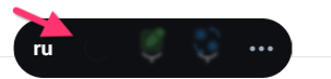
I noticed a small UI detail in your interface. The loading spinner in the panel almost blends in with the background. This makes it slightly difficult to track the status of operations.
Perhaps consider using a more contrasting color for the spinner or adding a subtle glow? This would enhance the UX and make the interface even more user-friendly.
A screenshot of the problem:
Please authenticate to join the conversation.
Upvoters
Status
Completed
Board
💡
Feature Request / Bug Report
Date
Over 1 year ago
Author

Web
Subscribe to post
Get notified by email when there are changes.
Upvoters
Status
Completed
Board
💡
Feature Request / Bug Report
Date
Over 1 year ago
Author
Web
Subscribe to post
Get notified by email when there are changes.